A concept site for a performance-car dealer
Client
Rogue Sport Cars
Year
2025
ROGUE is a self-initiated concept for a performance-car dealer. I gave the photography most of the screen and kept the interface quiet around it: dark backgrounds, a wide display typeface, and orange only on buttons and live counters. It runs long on purpose — hero, current lineup, specs, reviews, then the test-drive booking.
Scope of Work

Hero
The hero hands almost the whole viewport to the car and keeps the interface out of its way. A wide display typeface, one line of copy and a single orange button, with navigation, language and phone pushed into a thin top bar. It sets the rule the rest of this automotive landing page follows: the product is the interface, and the UI only appears when it has something to do.
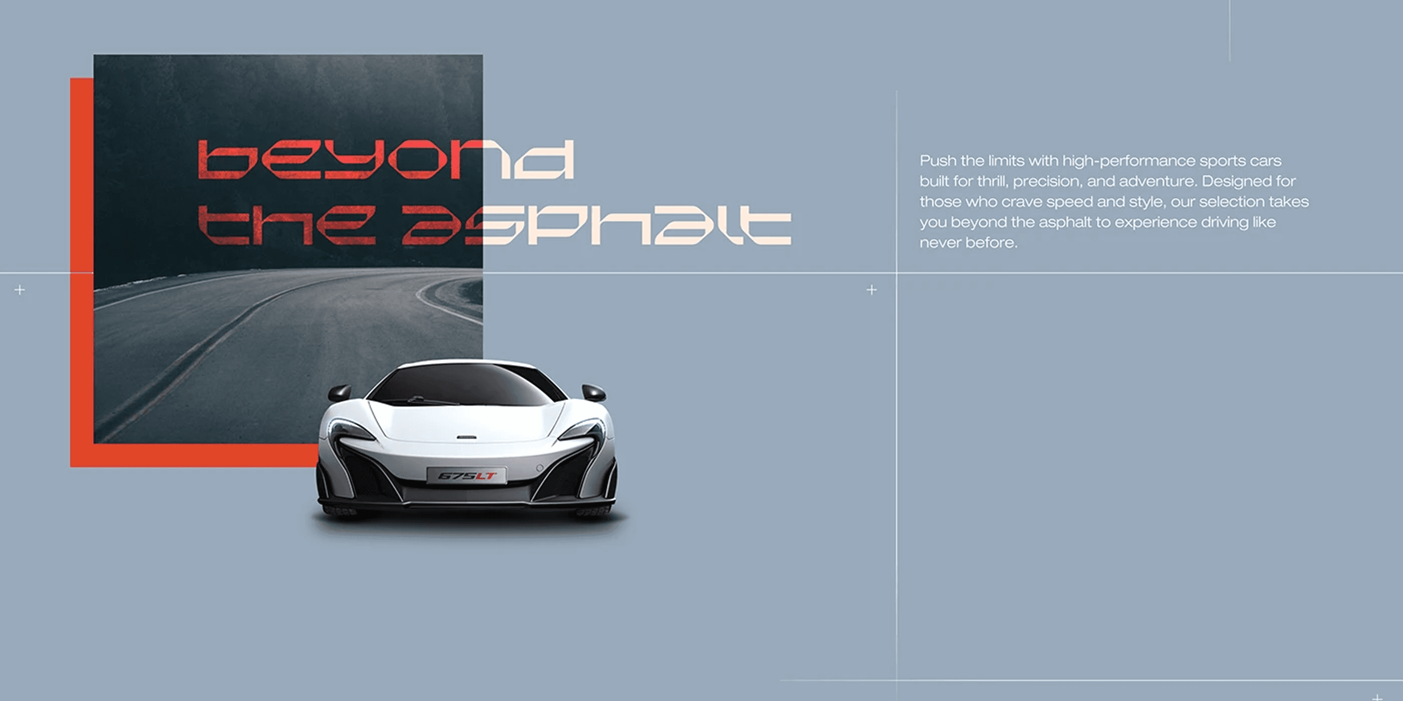
Beyond the asphalt
A short statement block sitting between two product sections, built to slow the scroll for a moment. The layout borrows from print, with an offset image, a red frame and a column of copy that carries the brand promise instead of a spec. In a long landing page these pauses do real work, because they give the eye somewhere to rest before the next run of photography.

Latest arrivals
The current lineup as a horizontal carousel, with every car cut out on a flat background so the row reads as a single object rather than three separate cards. Each model links straight through to its tech sheet. This is the first real conversion point of the page, so the interface stays deliberately plain: look, compare, click.

Selected brands
Two jobs in one screen. First the marques the dealer carries, set as a plain logo row that builds credibility without decoration. Then a featured build with interactive hotspots placed over the bodywork, so the visitor explores the car instead of reading a list. Those hotspots are the most interaction-heavy piece of the whole UI design and the part that rewards a slow scroll.

Specs
Performance figures shown as oversized numbers with the units dropped to a lighter weight, next to close-up photography of the parts those numbers describe. Buyers in this segment compare data before they compare brands, so the layout makes it scannable at a glance instead of burying it in a table. The gallery underneath reuses the same crops, which keeps the section visually tight.

Unleash performance
The softer break in a page otherwise dominated by product. A founder portrait, two short paragraphs about the service side of the business and an oversized pull quote set across the images. It is the only place in the layout where type is allowed to overlap photography, and that overlap is what makes it read as a statement rather than one more content block.

Reviews
Customer reviews laid over a night shot of a mountain road, with the live Google rating and review count sitting underneath. Putting the testimonial card on top of real photography keeps this from looking like a widget dropped into the page. Trust content sits here on purpose, immediately before the booking section, where hesitation usually happens.
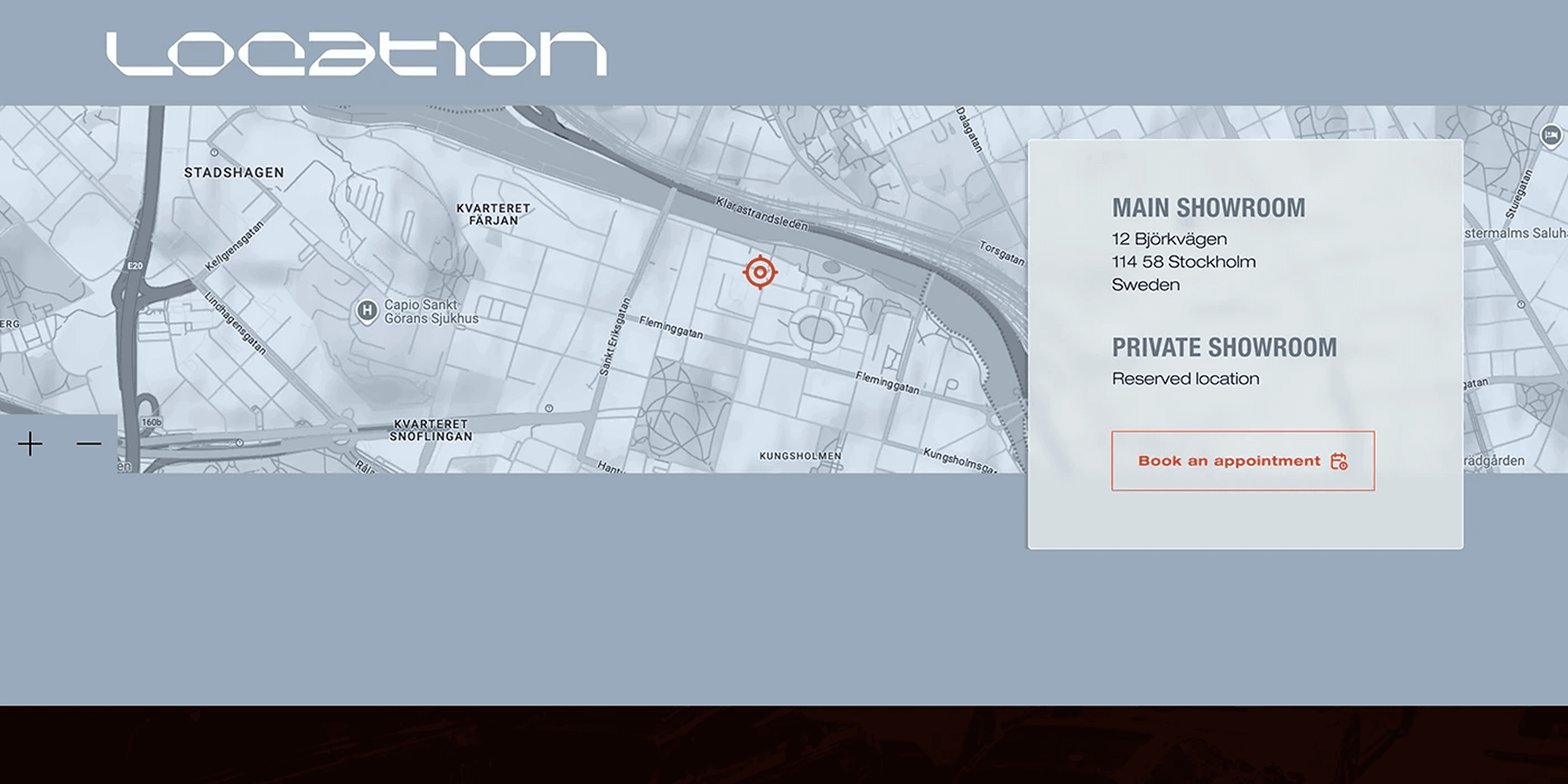
Location and booking
An interactive map, the showroom address and opening hours, and the single action the whole landing page has been building towards, which is booking an appointment. The private showroom is listed without an address on purpose, as part of the positioning. Every element on this screen exists to close the visit rather than to inform.

Full page
The complete landing page from hero to footer, so the pacing reads as one piece: product, pause, product, proof, action. Seeing a long scrolling site end to end is the only honest way to judge whether it holds attention, which is why I keep a full-length export of every web design project alongside the individual sections.
Need a website like this for your business? See my web design services or book a free call.