A lawyer’s brand built from blocks
Marcos Hernández Rojo is a lawyer and a property manager in Zamora, Spain. Two practices under one name: legal advice, and the day-to-day management of residential buildings.
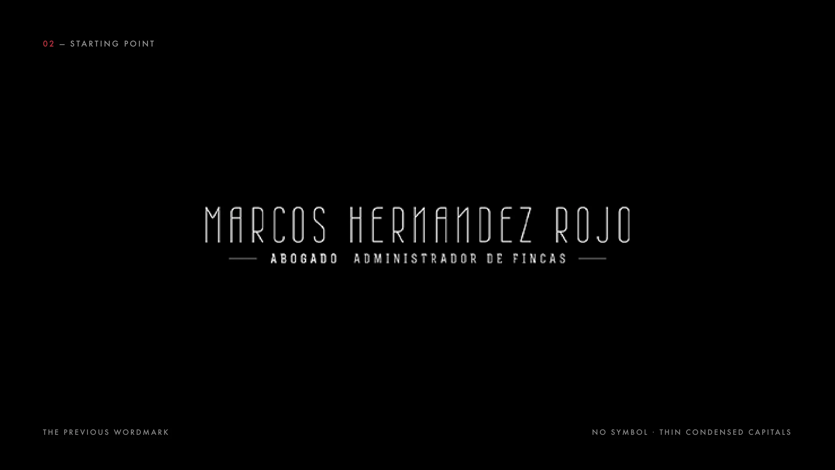
His previous logo was a wordmark in thin condensed capitals, with no symbol. It worked on a letterhead, but there was nothing to recognise him by on a stamp, a plaque or a profile picture, the places where a local professional is actually seen.
The brief was a mark that could carry both practices, read as a lawyer without looking like every other law firm in town, and hold up at any size.
The result is a monogram built from square blocks on a single grid, one red that belongs to him, Futura for the name, and a set of applications from the stationery to the office window.
Scope of Work
- Brand Strategy
- Visual Identity
- Logo Design
- Applications
Where he started
Before drawing, I collected the precedents: his existing wordmark and the identities of the law firms in his area. The old logo had some character in the type, but no symbol, and the tagline spelled out both practices in full, which made it long and hard to read small.
What the sector looks like
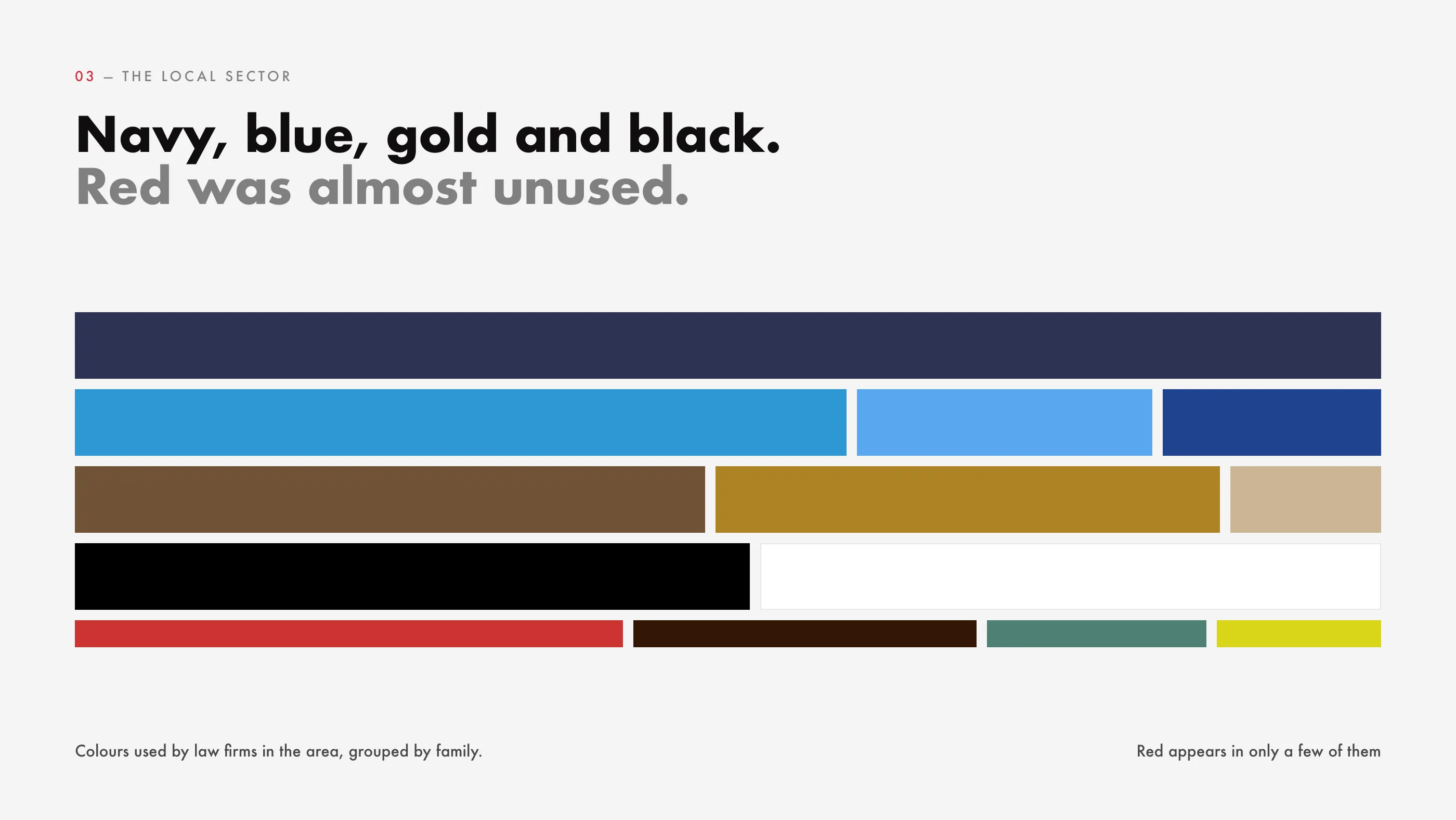
I mapped the colours of the local firms on a colour wheel. Most sit in the same places: navy and blue for seriousness, gold and brown for tradition, black for authority. Red appeared in only a few. For a lawyer who wants to be remembered in a small city, that was the space to take.
Two routes
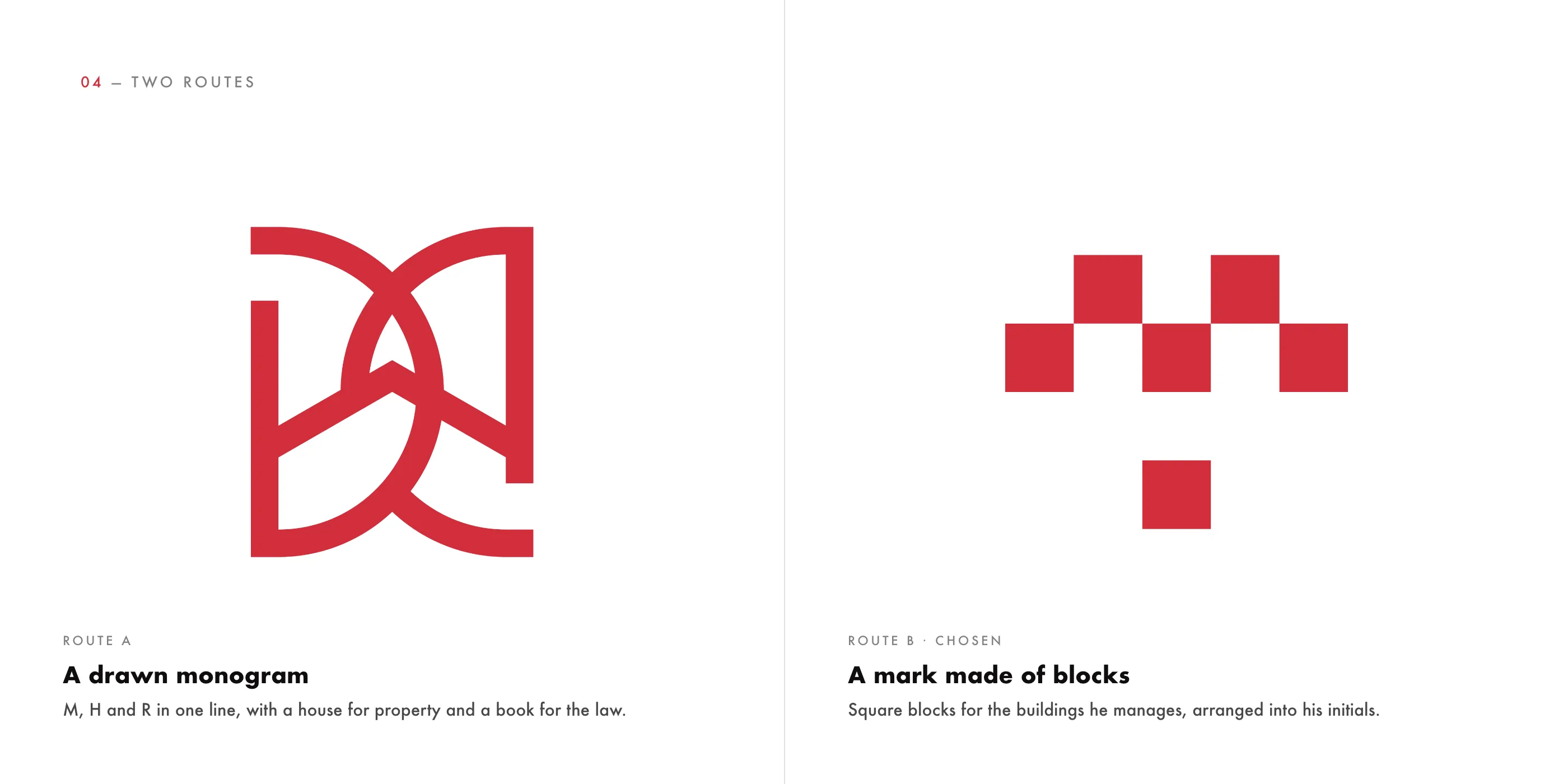
I presented two directions. Route A drew M, H and R in a single line, with a house for the buildings he manages and a book for the law, set in a serif. Route B built the initials from square blocks, each block a property, set in Futura. Both were shown on the same applications, so the choice was about the idea and not the mockup. Marcos chose the blocks.
A revision worth making
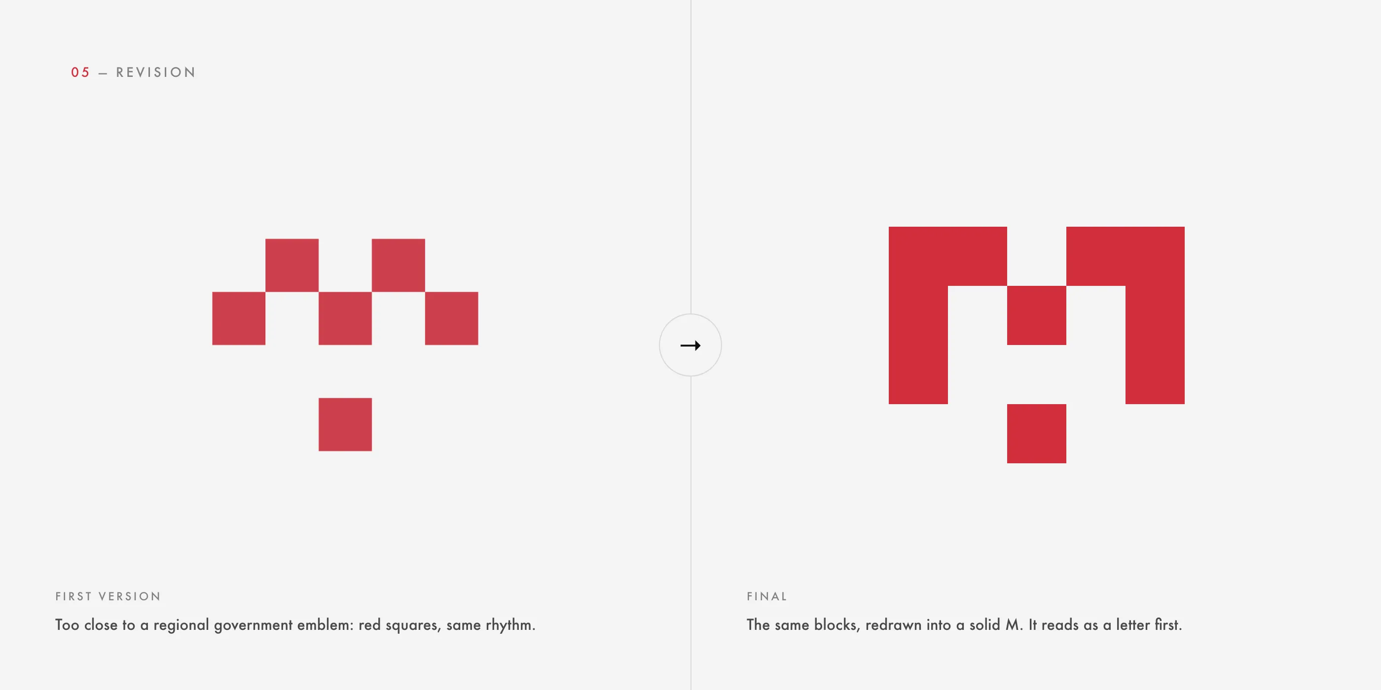
The first block mark had a problem: red squares in that rhythm read too close to a regional government emblem in Spain. A lawyer cannot look like an institution he is not part of. I redrew the same blocks into a solid M, which reads as a letter first and as a pattern second.
One grid, four meanings
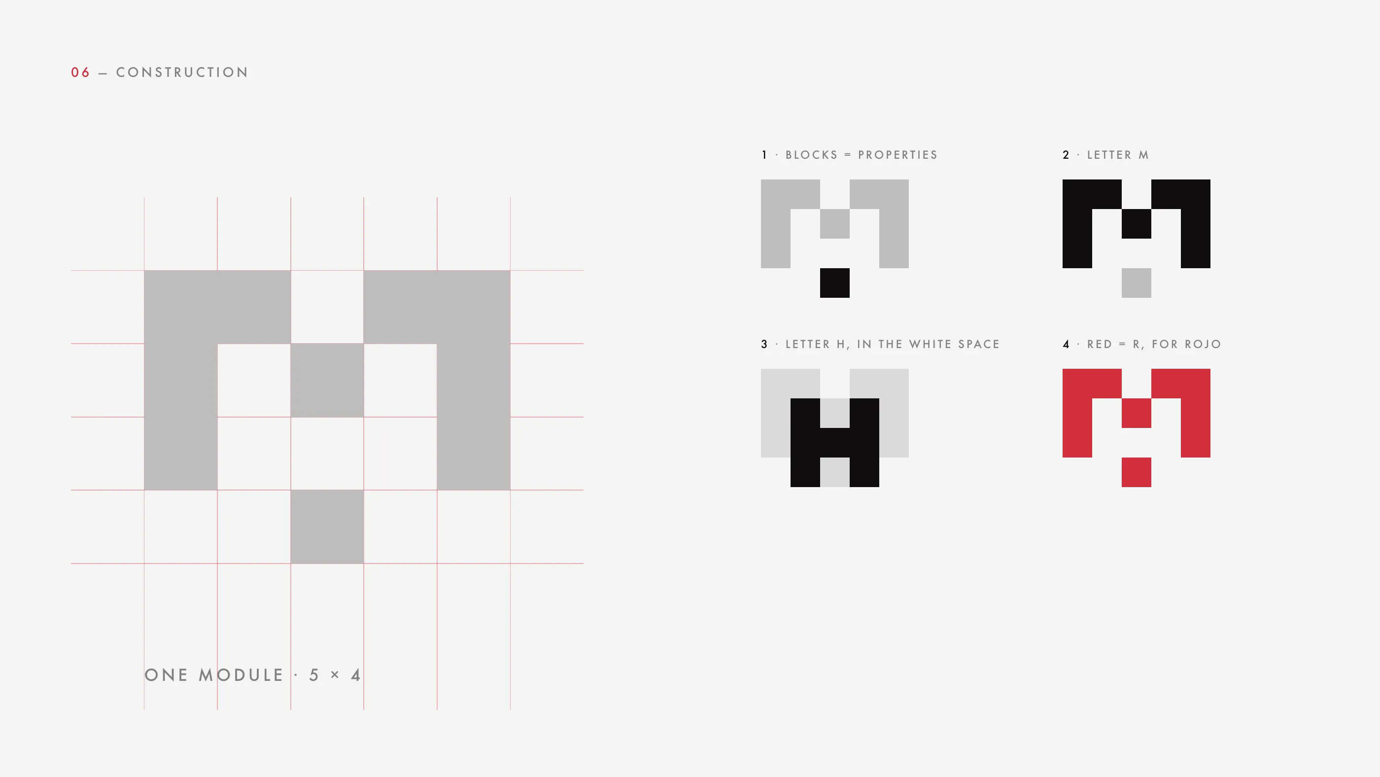
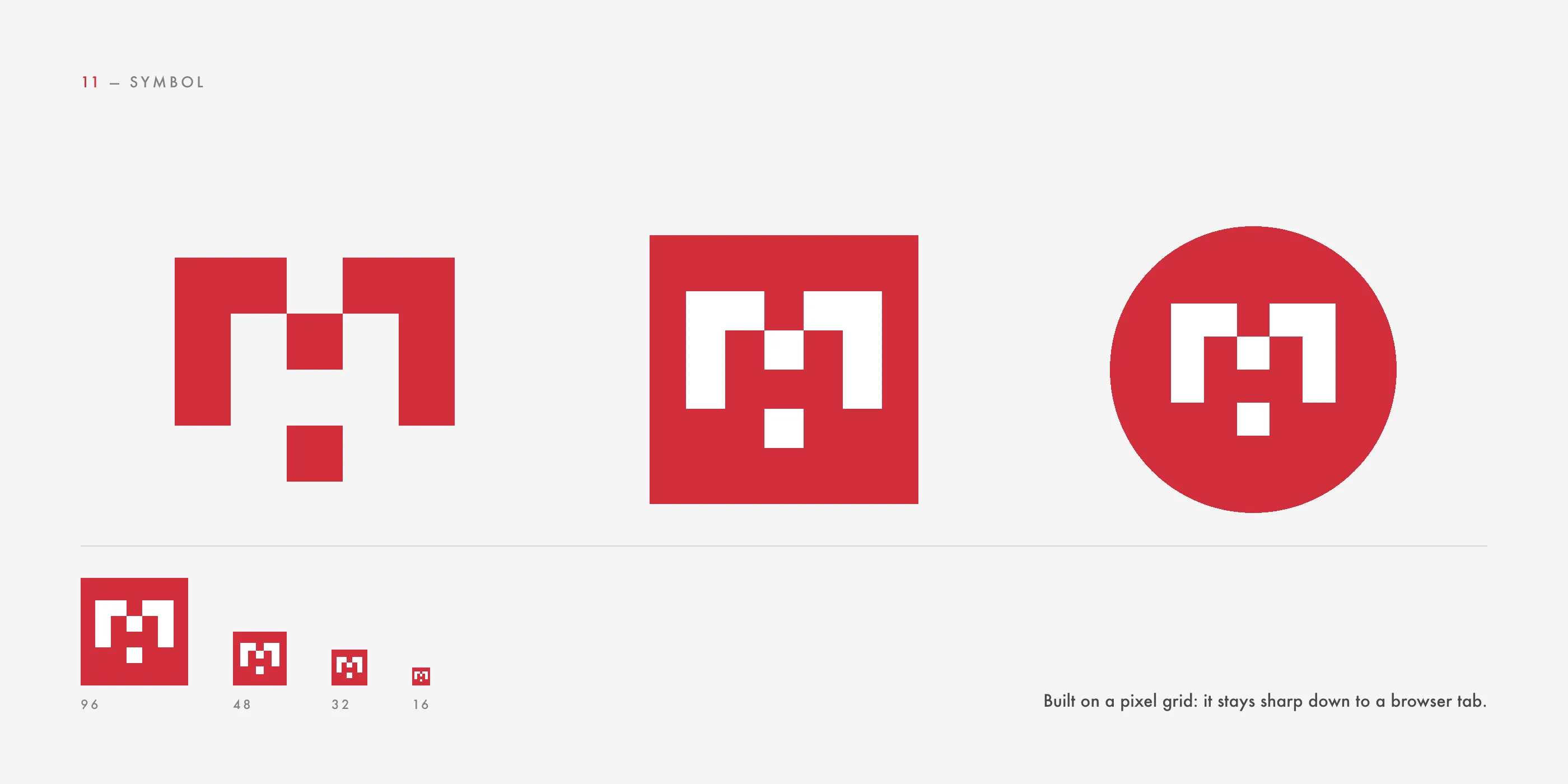
The mark sits on a 5 × 4 module. The blocks stand for the properties he manages. Together they draw the M of Marcos. The white space inside the M forms an H, for Hernández. And the red is the R: rojo means red in Spanish, so the colour carries his surname.
Name first, practice second
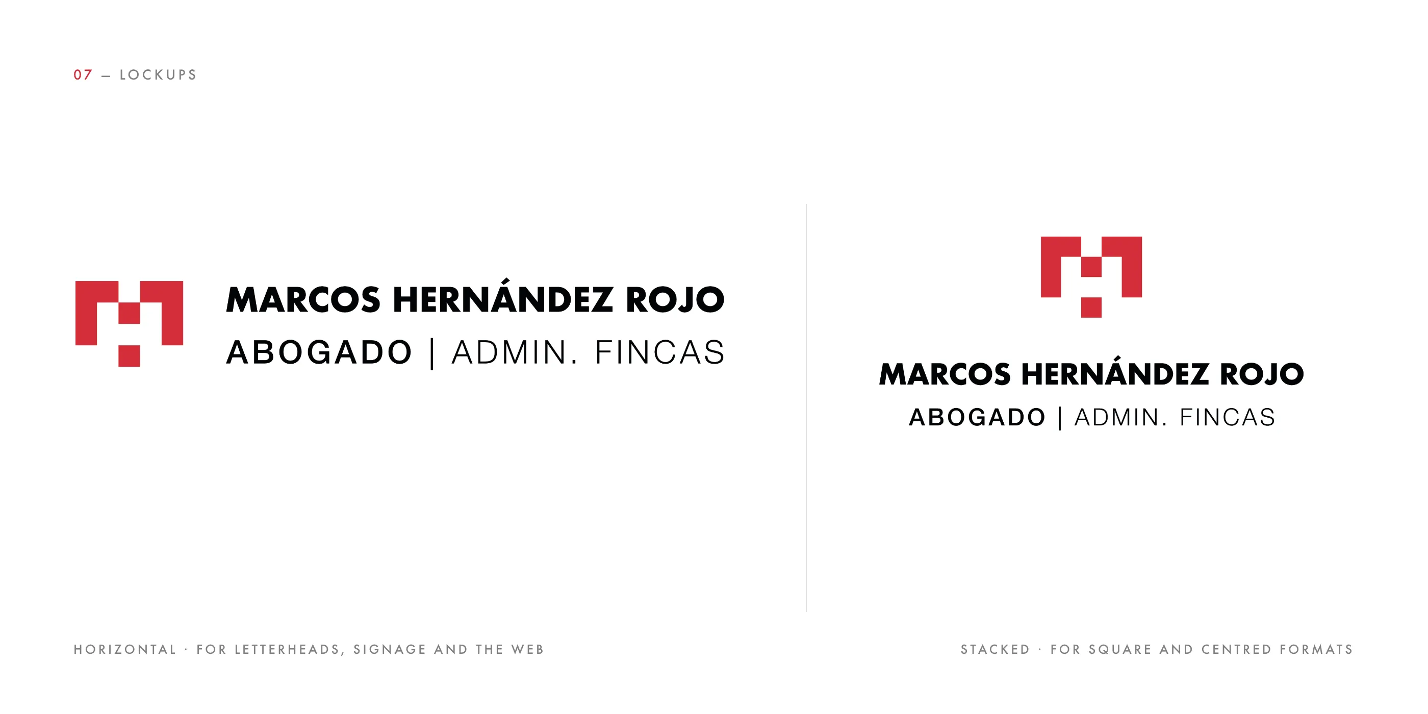
The name is set in Futura Bold, geometric like the blocks. During the revision I tested a dozen versions of the tagline and shortened “Abogado & Administrador de fincas” to “Abogado | Admin. Fincas”: the same information in half the length, readable at stamp size. There is a horizontal lockup for letterheads, signage and the web, and a stacked one for square formats.
On white, on red, on black
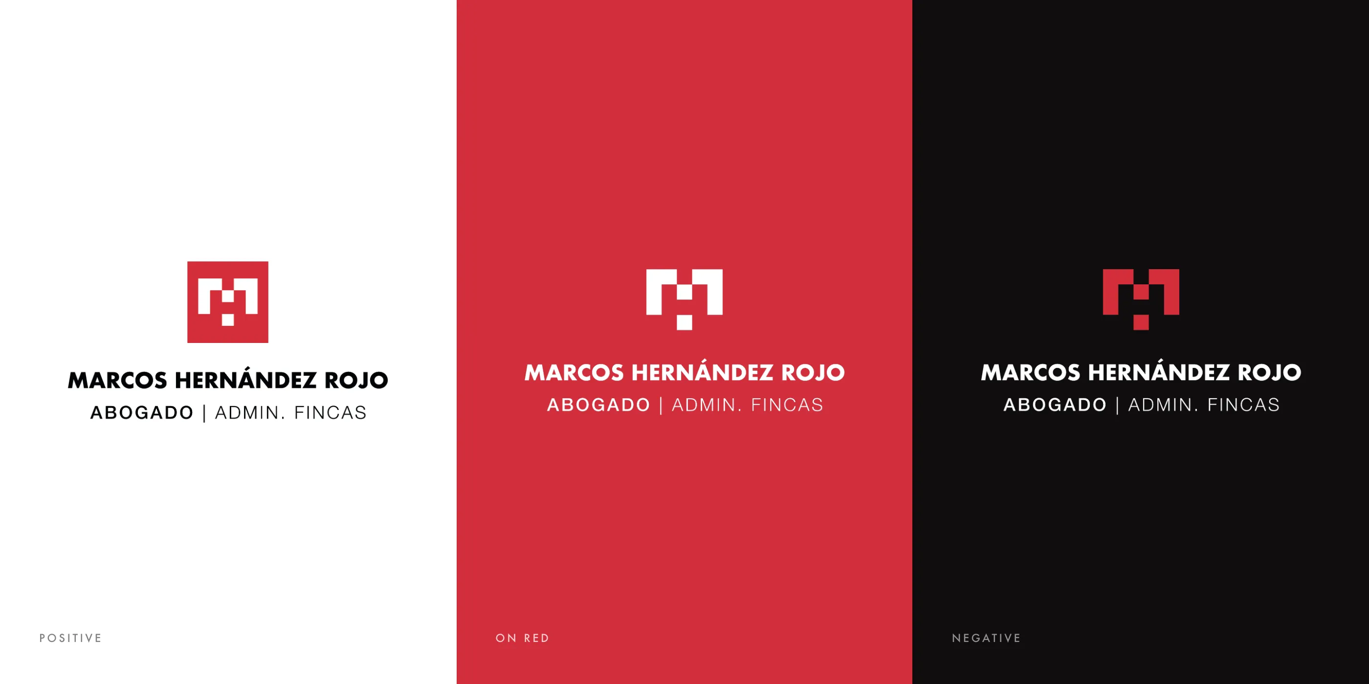
The identity works in red and black on white, all white on red, and red and white on black. Every version comes from the same master files, so a new use never needs a new drawing.
One red, and nothing that competes with it
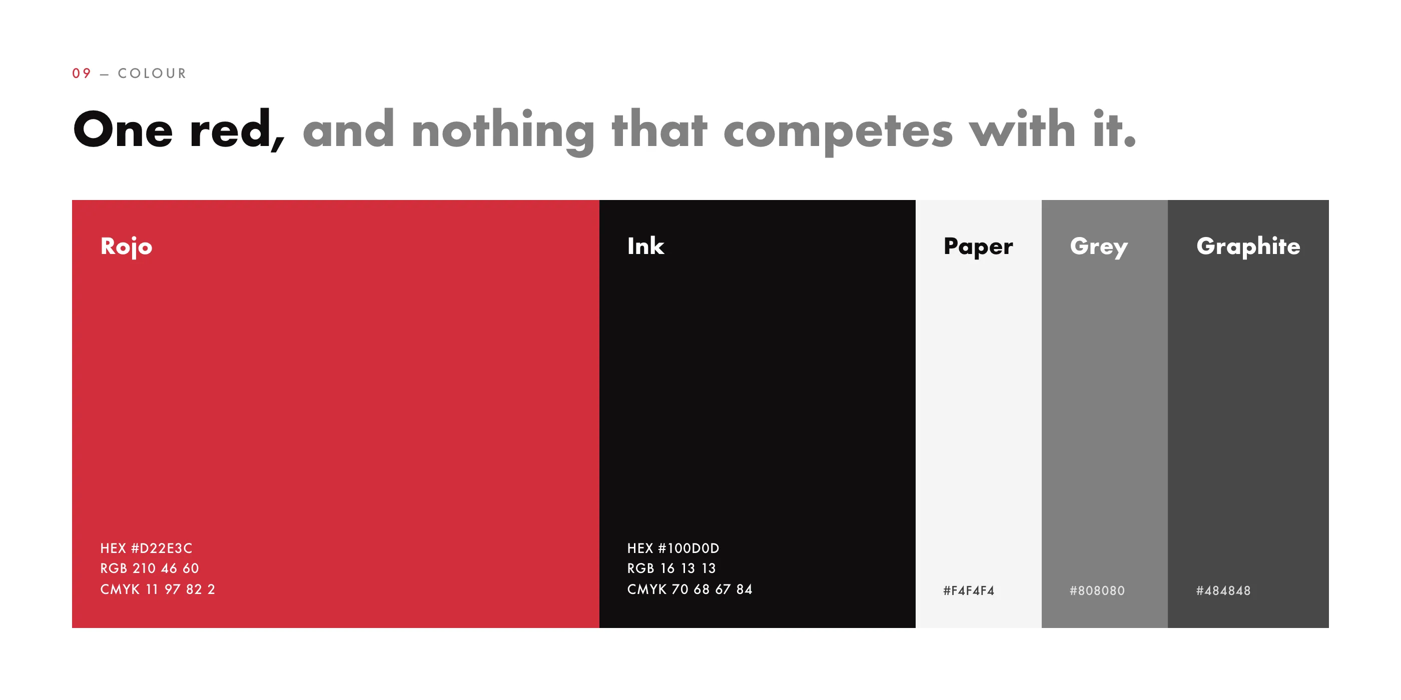
Rojo (#D22E3C) carries the brand. A near-black ink and three neutrals support it and never compete with it. On a street of navy and gold signs, the red is what people remember.
Futura, top to bottom
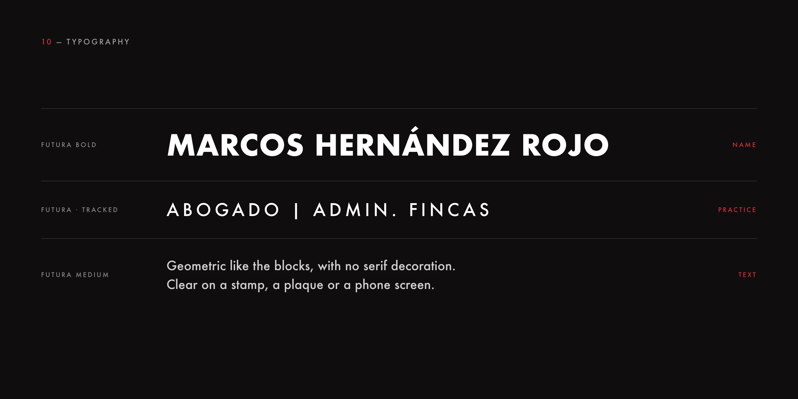
One family across the system: Futura Bold for the name, Futura tracked wide for the practice and for short texts. Geometric and without decoration, it stays clear on a rubber stamp, an engraved plaque or a phone screen.
Sharp at any size
Because the symbol is built on a pixel grid, it scales down without losing detail: a square and a round version for profile pictures, and a favicon that stays sharp at 16 pixels.
Applications
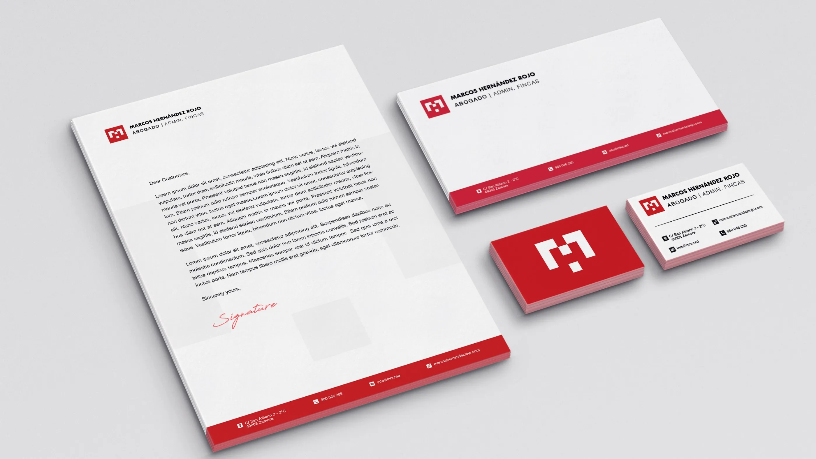
I took the identity to the places where a lawyer and property manager is actually seen, starting with the paper. Letterhead, envelope and business cards share the red band and the horizontal lockup; the back of the card is the symbol alone, white on red.
On the window
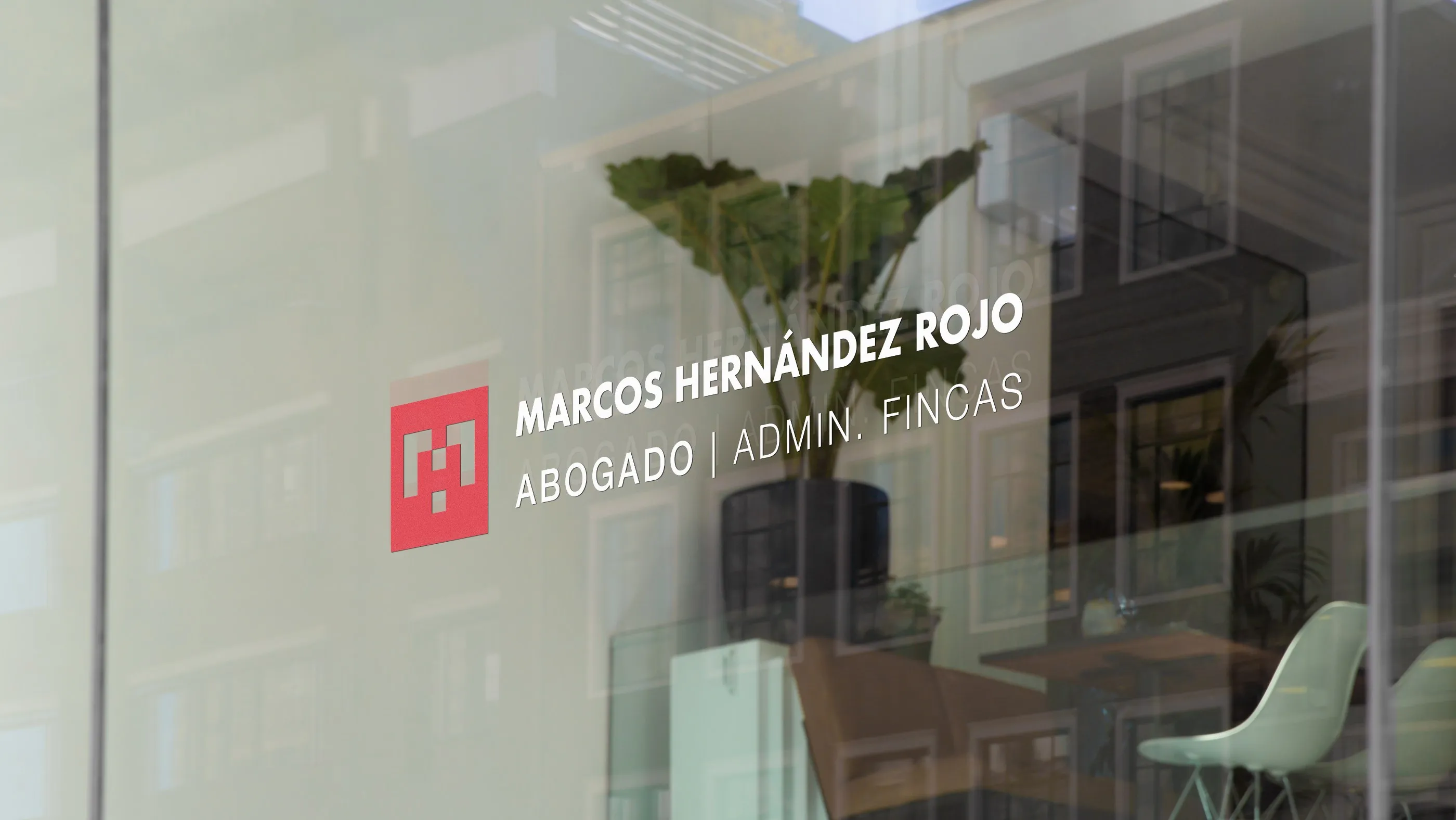
Window vinyl for the office: the red badge and the name in white, readable from the street without covering the view inside.
On every document
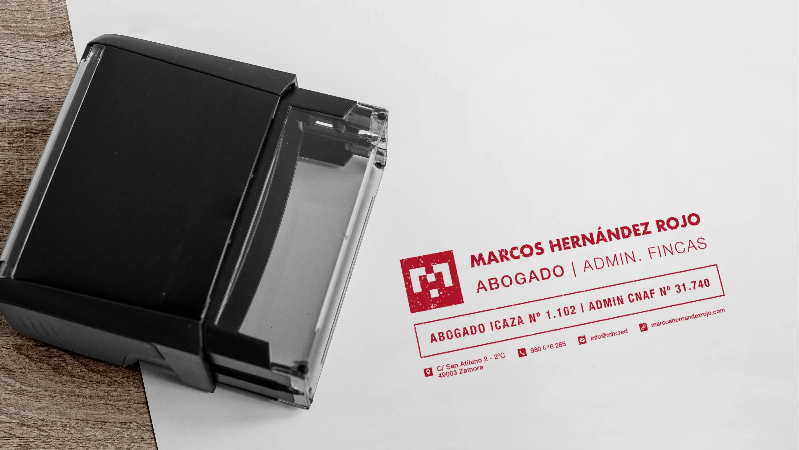
A self-inking stamp with the badge, the name and his professional registration numbers, for the documents he signs every day.
Inside the office
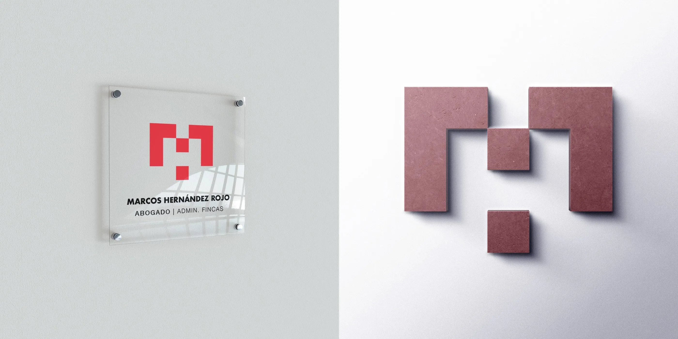
An acrylic plaque for the office and the symbol in relief, the blocks becoming real volumes.
Online
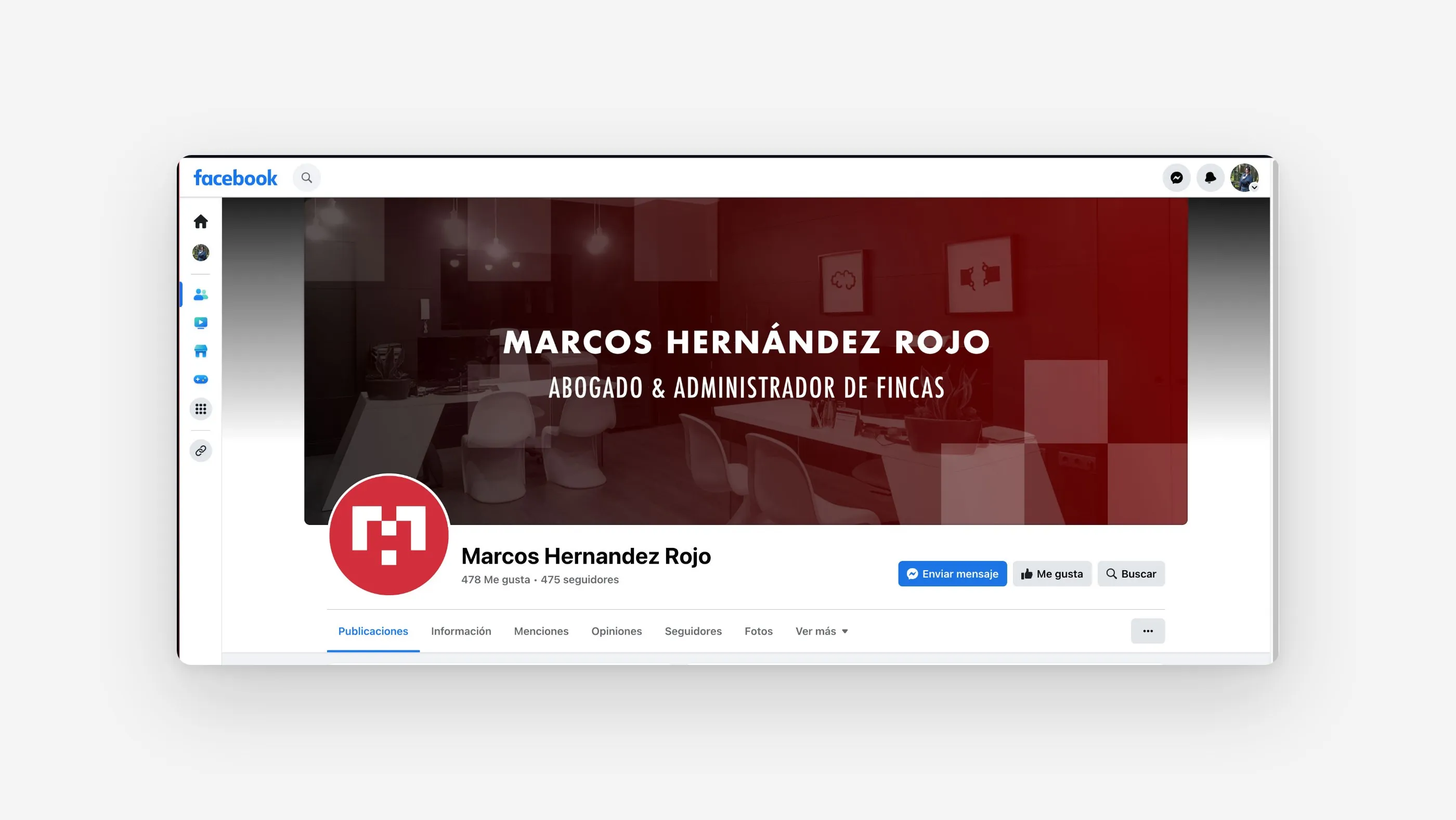
The Facebook page uses the round symbol as its profile picture and the name over a red cover, so the page and the door plaque look like the same practice.
What I took from it
Checking a new mark against the competition is not enough. It also has to be checked against the emblems people already know in that place, from the town hall to the regional government. The revision took one more round and saved Marcos a logo that would always have looked borrowed.
Need a brand identity for your practice or business? See my brand identity services or book a free call.