A concept site for a Toro winery
Teso la Monja is a self-initiated concept for a high-end winery in the Toro region. The bottles are rare and expensive, and the site had to feel that way without shouting about it. Near-black backgrounds, a high-contrast serif, one deep wine-red, and a lot of empty space around each bottle. The interactions are slow on purpose.
Scope of Work
- Web Design
- UI Design
- Concept
- Figma
The concept in context
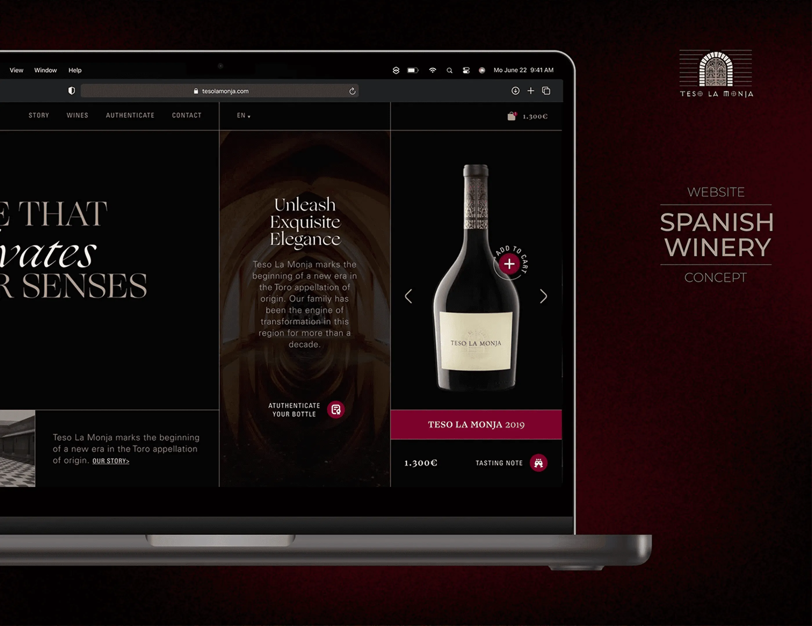
The concept shown in context, on a near-black screen with a sharp serif and a single wine red. Luxury web design usually announces itself with a big logo and a lot of gold. Here the restraint does that job instead: heavy margins, small type and one accent colour, which is closer to how the bottles themselves are labelled.
The range on screen
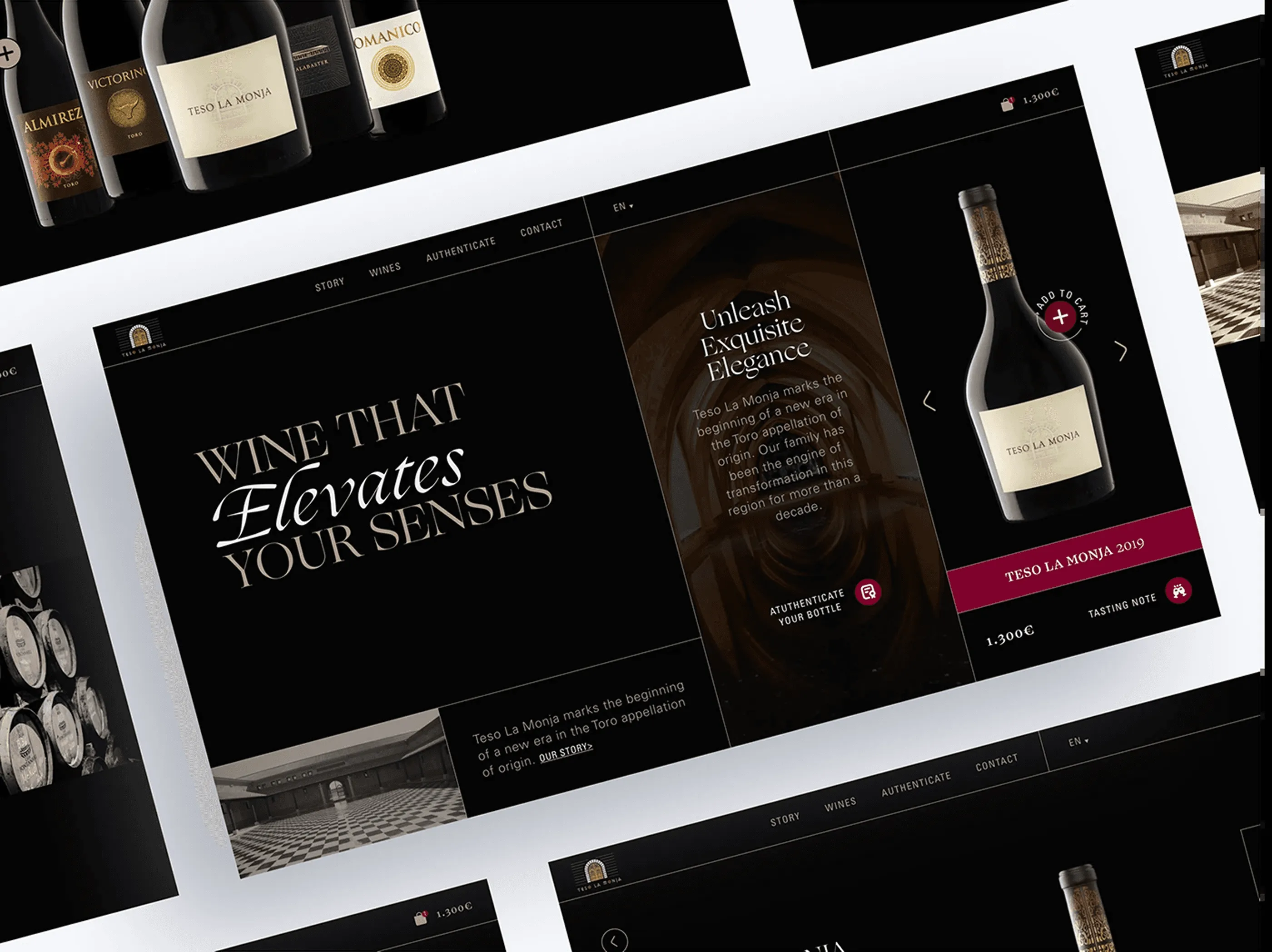
The main screens laid out together so the layout can be judged as a system rather than a single composition. The same three-column structure carries five different wines, each with its own photography and colour temperature. Seeing them side by side is how you check that a template flexes without breaking, which matters more than any individual screen looking good.
Wine that elevates your senses
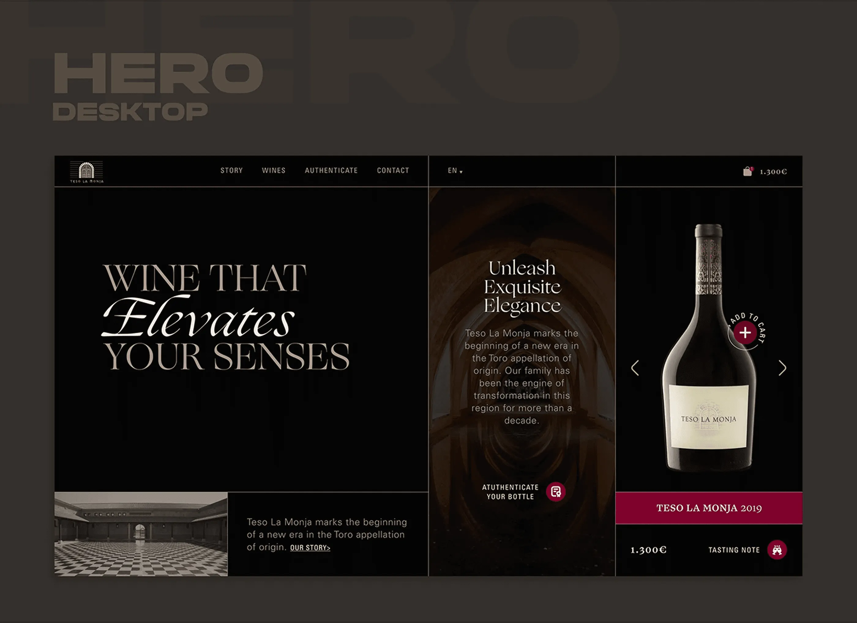
The homepage divides into three columns that each do one job: the editorial headline, the brand story over cellar photography, and the bottle itself in a carousel with price and tasting note always visible. Nothing scrolls above the fold, so the first screen works as a fixed composition. For a winery selling at this price point, showing the cost immediately is a filter rather than a risk.
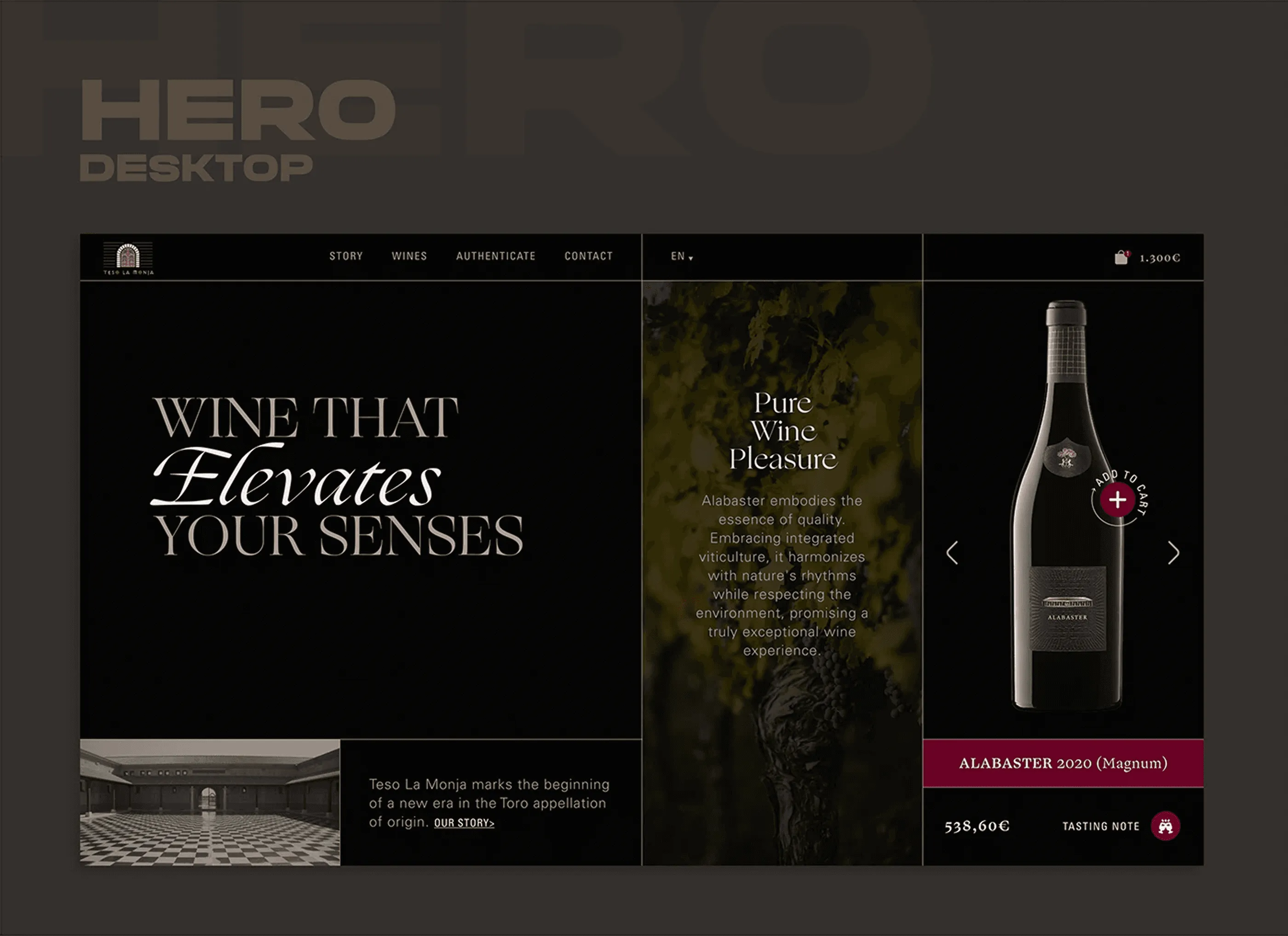
Alabaster
The same hero carrying a different wine. The structure holds while the photography, the label and the background tone all change, which is what turns a homepage into a template the client can actually run. Alabaster brings a colder cellar image and a paler label, and the layout absorbs both without any adjustment to the grid.
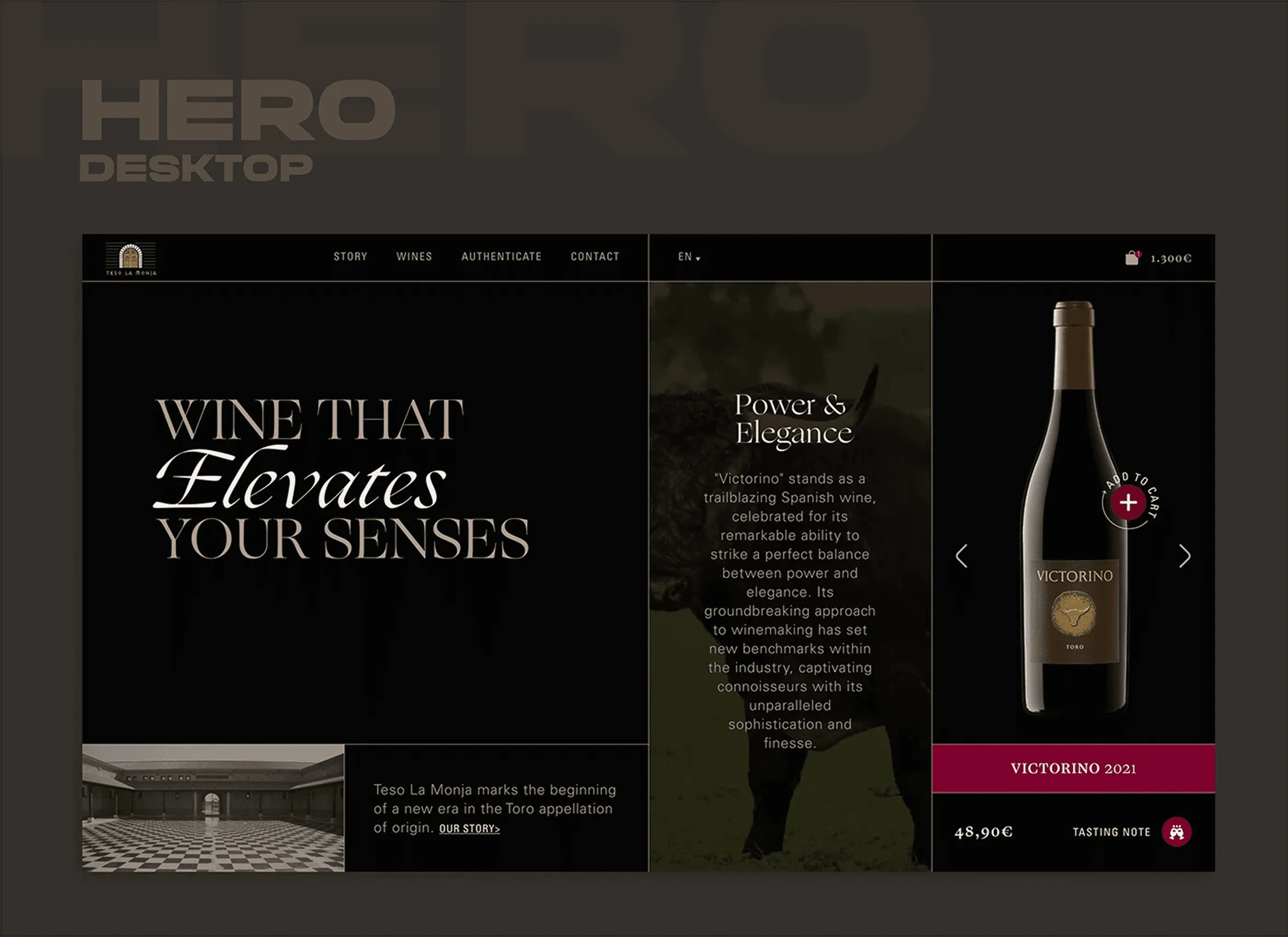
Victorino
A third pass at the hero, this time with Victorino and a green-tinted vineyard image. Three variants is usually the point where you find out whether a layout is a system or a lucky composition. The type sizes, the carousel controls and the price block stay fixed across all of them, so only the content changes.
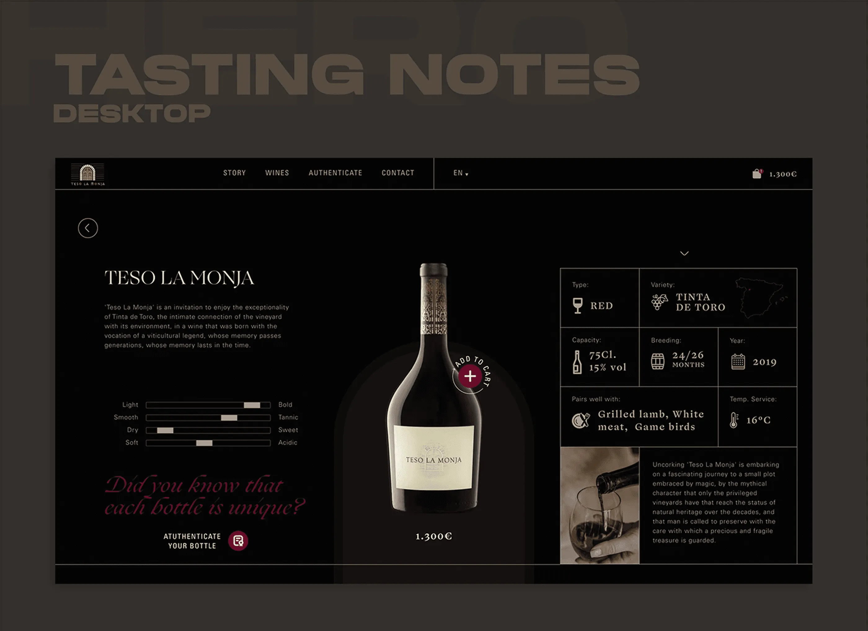
Tasting notes
The product page opens with the bottle centred and the technical data set out to be studied rather than skimmed: grape, vintage, ageing, alcohol and serving temperature. Buyers at this level read specifications the way they read a label, so the layout gives each figure its own space instead of compressing them into a table. The add to cart action sits close to the price, kept in the wine red used nowhere else.
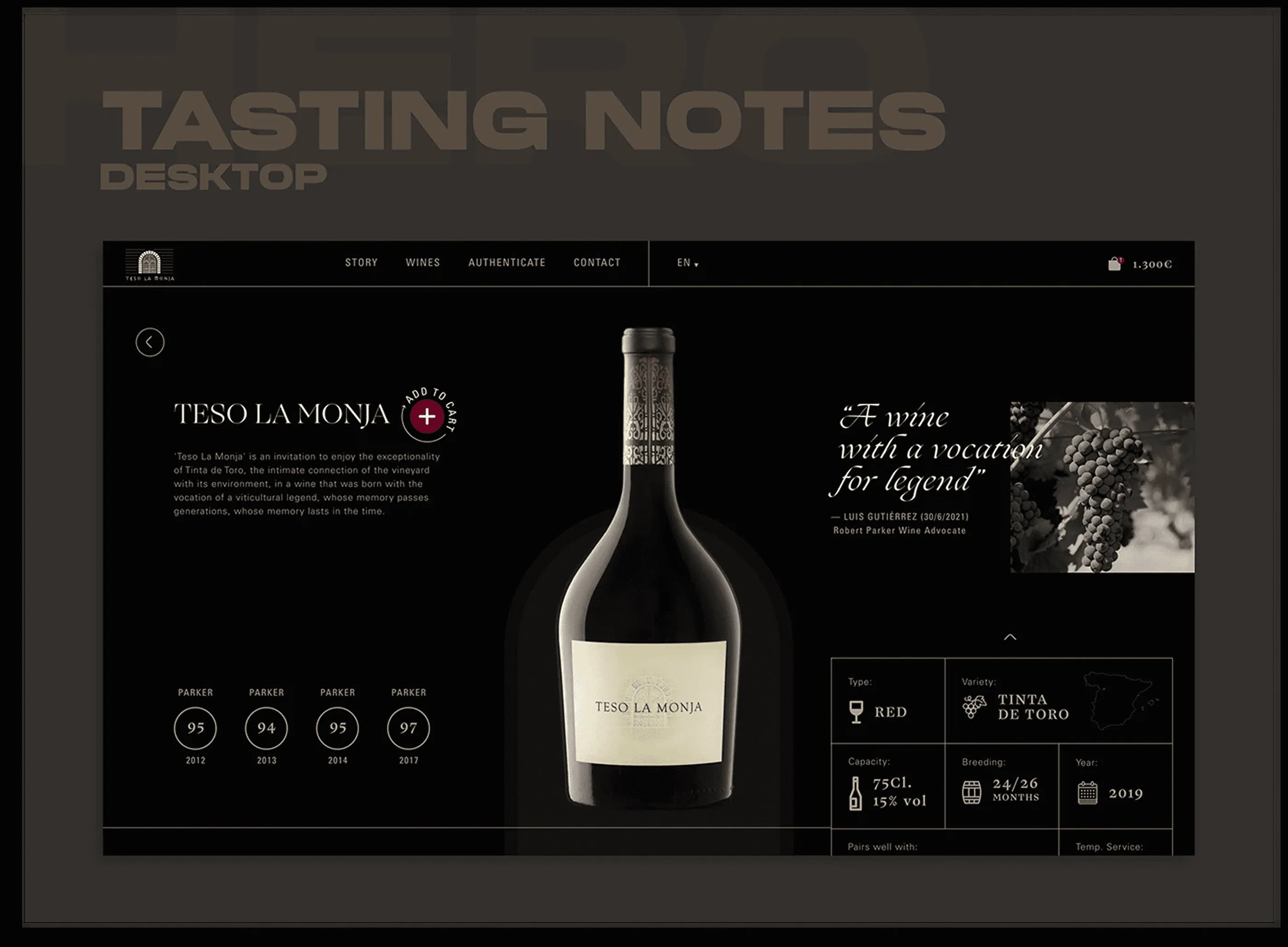
A wine with a vocation for legend
The full product page, with the tasting sheet on one side and the story of the vintage on the other. Splitting fact from narrative lets two different visitors use the same page, the collector scanning data and the newcomer reading the story. The circular icons carry the tasting notes visually, which keeps the technical block from becoming a wall of small type.
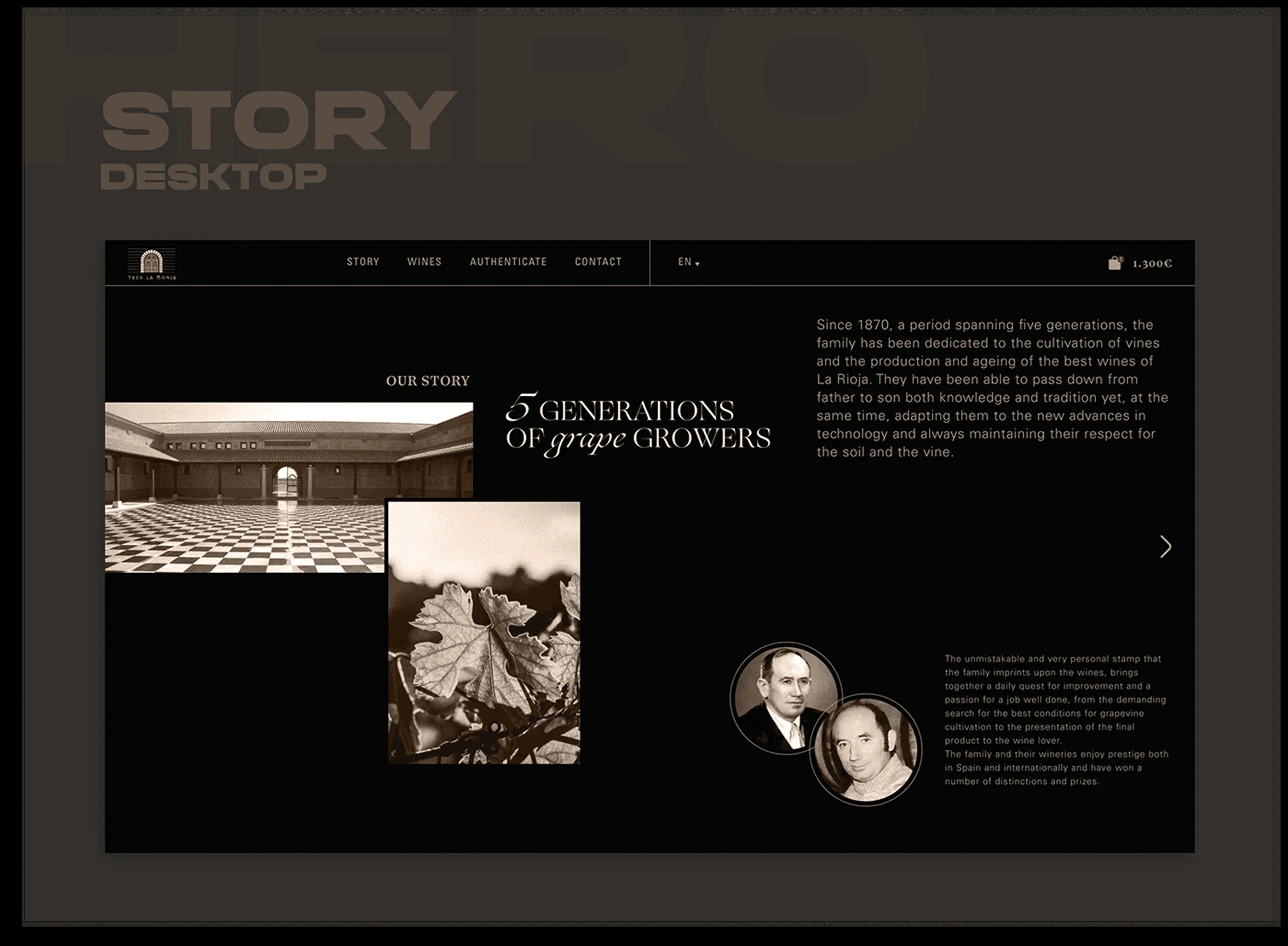
Five generations of grape growers
The family history in archival photography and quiet typography, running across five generations of grape growers. This is the section that justifies the price, so it sits before the shop rather than after it. The images are given room to breathe and the copy stays short, because a heritage story loses its weight the moment it turns into an essay.
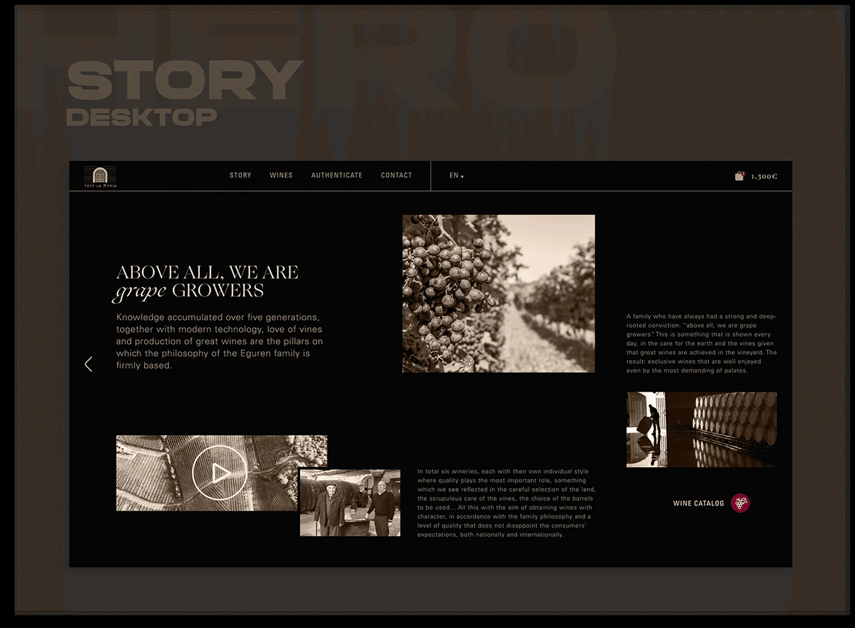
Above all, we are grape growers
The second half of the story, built around video and a grid of images from the vineyard and the cellar. Motion is introduced only here, which keeps it feeling like documentary footage rather than a website effect. The layout stays asymmetric on purpose, so the section reads as a spread from a book instead of another content module.
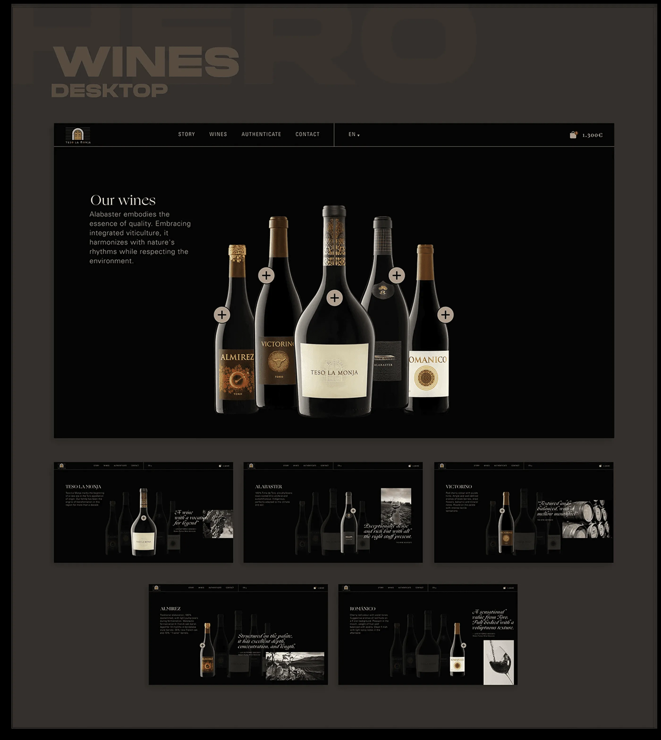
The full range
The complete range lined up as a family, each label acting as a way into its own page. Below, the individual wine pages show how the same product template carries five very different bottles. For a winery, the range page is the real navigation, because most visitors arrive knowing the producer but not which wine they want.
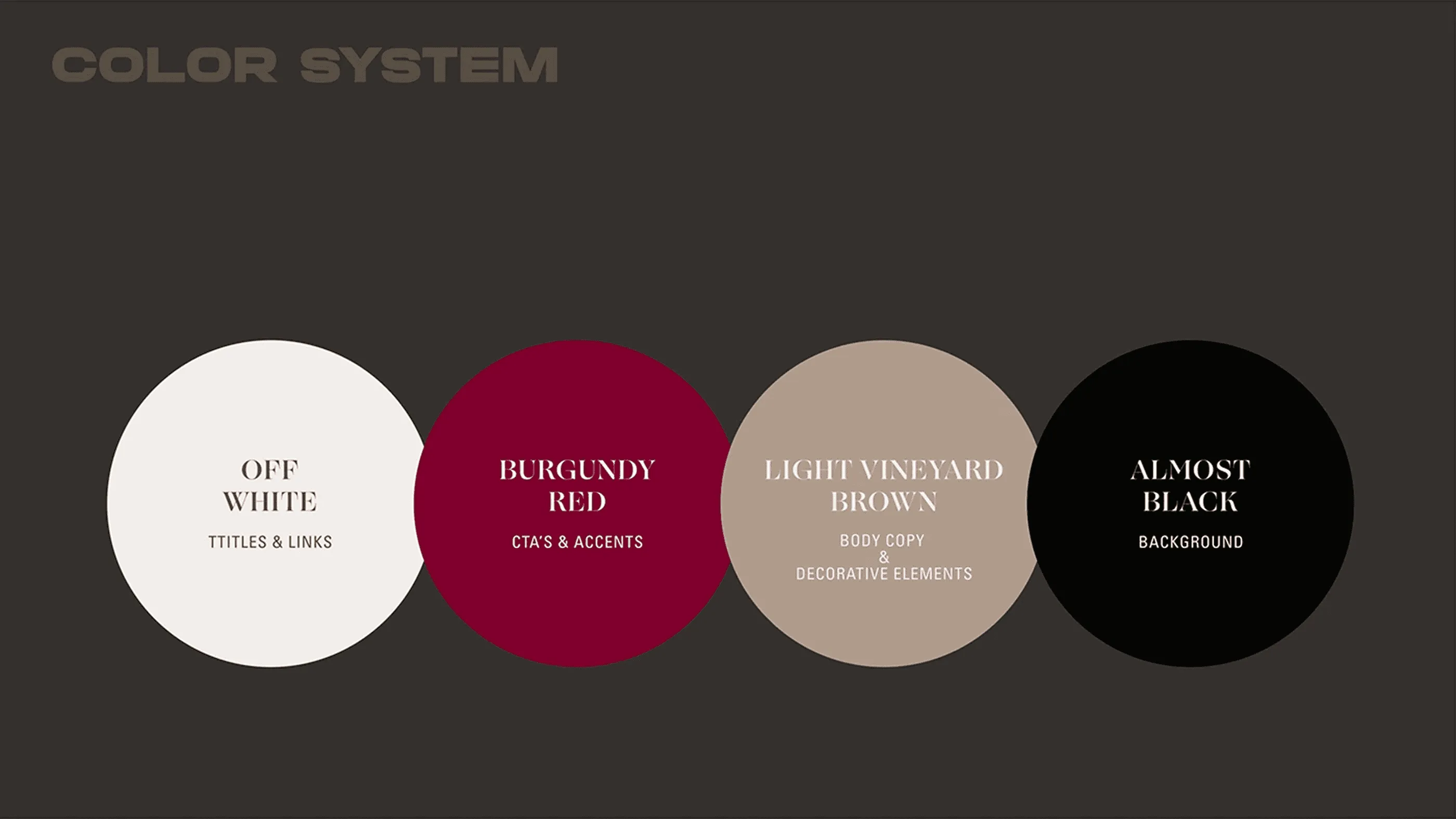
Four colours, mostly black
Four colours, and mostly black. Off white for titles, burgundy red for calls to action, a vineyard brown for body copy and almost black holding every background. The red appears only where something is clickable, which means the interface never needs a button outline to explain itself. Restricting the palette this far is what lets a dark layout feel expensive rather than heavy.
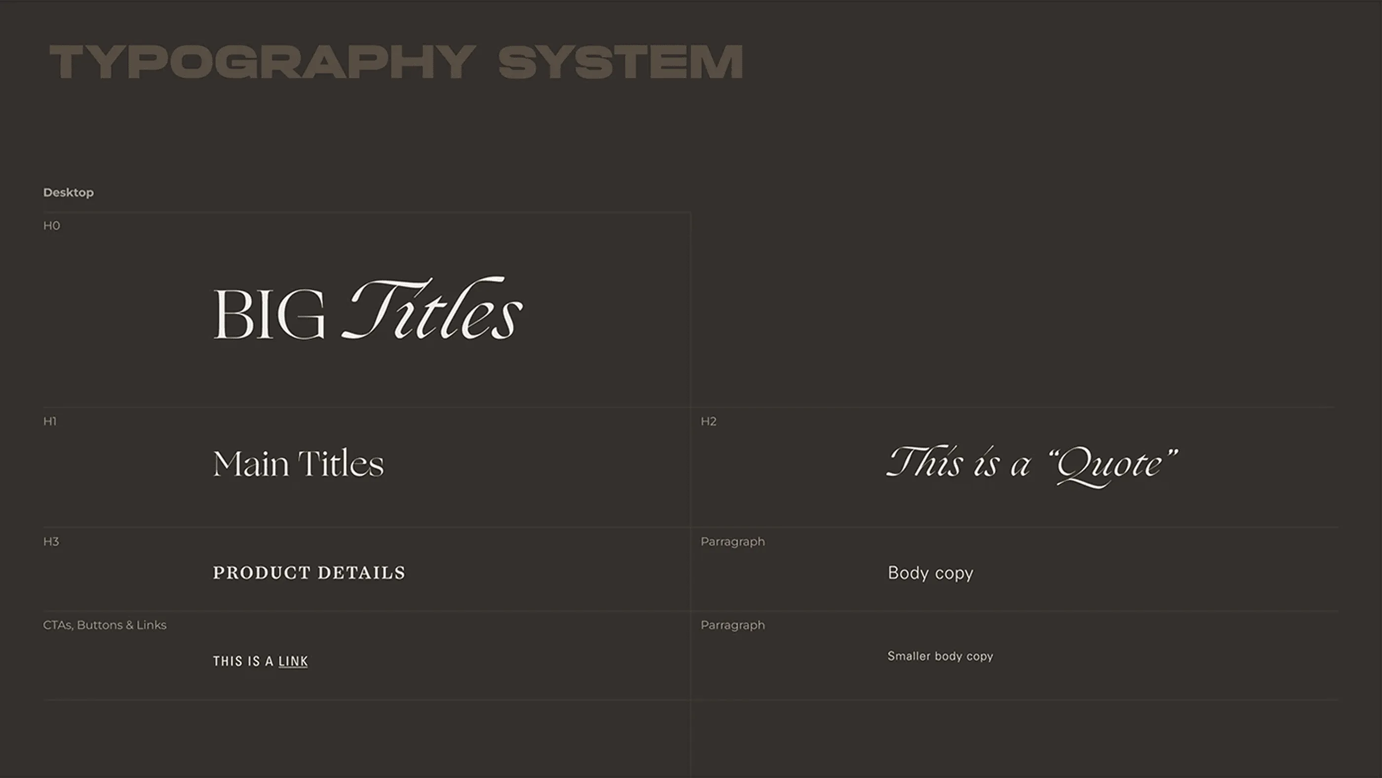
Serif all the way down
A display serif for the big titles, an italic cut for quotes and small caps for product data. There is no sans anywhere in the system, which is unusual for a website and is exactly what keeps the whole thing reading like a wine label rather than a shop. The scale is specified from H0 down to small body copy, so the hierarchy stays intact across the homepage, the product pages and the story.
Need a website like this for your business? See my web design services or book a free call.